Abstract
A chart designed for a desktop monitor often becomes unreadable when a social network scales it to fit a phone screen.
The fix is to design for the phone from the start: split the graphic into several 1080x1350 cards that a platform renders as a swipeable carousel, each card readable at feed width.
This tutorial covers the sizing math, the layout rules (horizontal bars over vertical stacks), the font-size calculation, rendering with a headless browser, and pixel-level verification.
Prerequisites
- A way to render HTML to PNG at exact dimensions: Brave headless (used here), Playwright, or any screenshot tool that accepts a window size.
- The data for the chart, with real computed values (not placeholder numbers from a sketch).
- Optional but recommended: a vision-capable model to check the render, and ImageMagick or Python PIL for pixel measurement.
Step 1: Understand the Sizing Math
A phone screen is about 400 points wide. An image designed at 1080 pixels wide is scaled down by roughly 2.7x to fit. That means a font that looks fine at 38px on a 1080px canvas renders at about 14px on the phone – below comfortable reading size.
The rule: size fonts for the display width, not the canvas width. If you want 24px text on the phone, use about 65px on a 1080px canvas. The debt chart cards use 42px body text and 50-58px labels, which land at 16-22px on the phone – comfortably readable, including for older eyes.
Use 4:5 (1080x1350) or square (1080x1080) cards. Facebook, X, and most platforms display these at full width in the feed without cropping, and a post with multiple images becomes a swipeable carousel.
Step 2: Choose Mobile-Friendly Layouts
A tall vertical stacked column is the worst shape for a phone: when scaled to width, the whole chart is a narrow strip and every label is tiny. The original debt chart was exactly that – a single tall graphic with all five levers, the arithmetic, and the notes stacked vertically (1100x1400, shown here as built):

Two layout choices survive the trip:
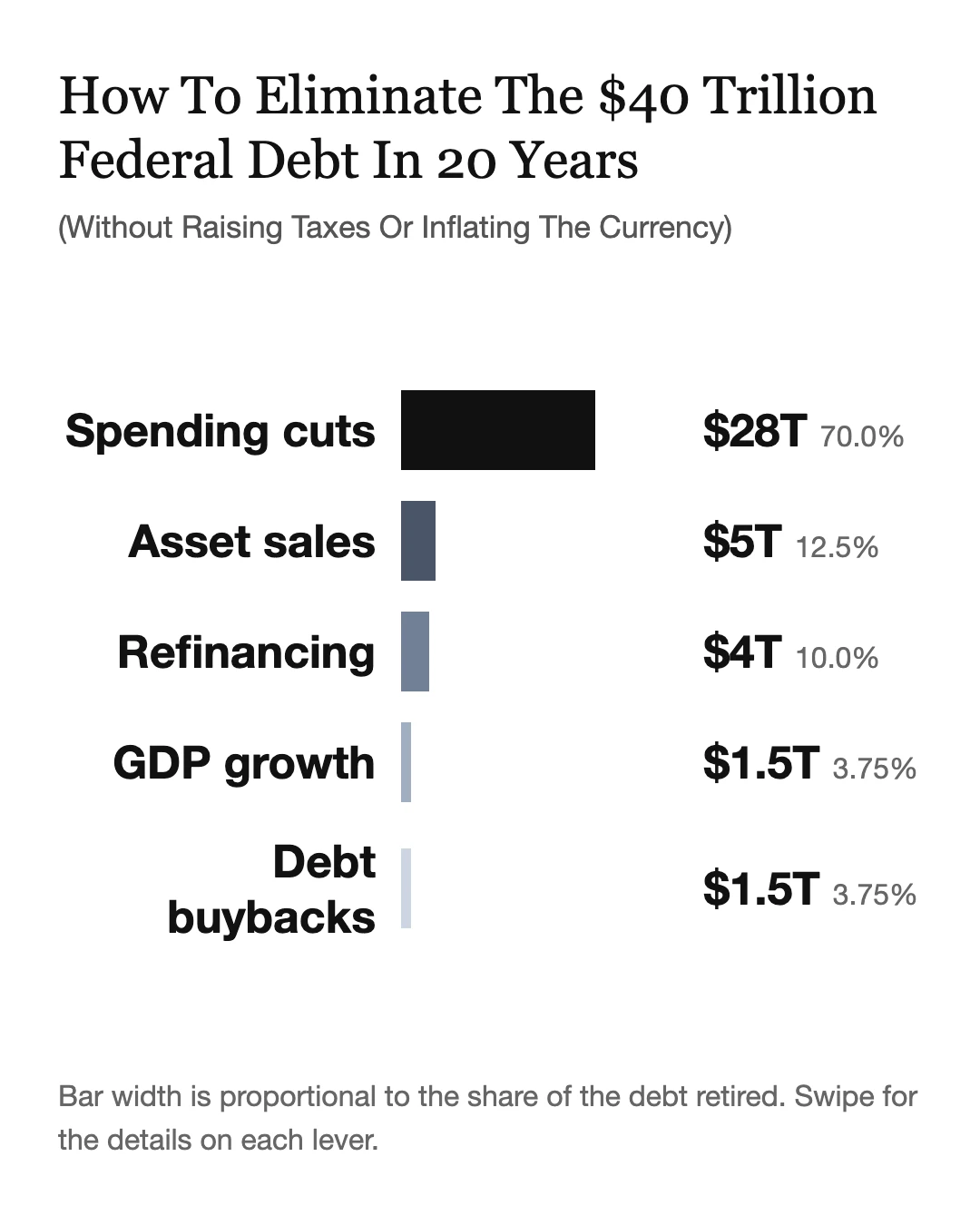
Horizontal bars, one per data series. Each row carries its own label, bar, and value, so the card reads as a list of self-contained lines. This is what the debt chart card 1 uses: five rows, each with the lever name, a proportional bar, and the dollar figure.
Split the footnotes onto their own cards. The chart card shows the shape; each following card carries one or two numbered notes with full sentences. Nothing is squeezed.
Keep one idea per card. The debt chart became four cards: the chart itself, notes 1-2, notes 3-4, and note 5 with the arithmetic summary.
Step 3: Write the Cards as Self-Contained HTML
Each card is one HTML file with a fixed-size body. The pattern (from the debt chart cards, archived at ~/av/ast/img/debt-chart-mobile/):
<!DOCTYPE html>
<html>
<head>
<style>
  html, body { margin: 0; padding: 0; background: #ffffff; }
  body { font-family: system-ui, sans-serif; color: #111111; }
  .card { width: 1080px; height: 1350px; box-sizing: border-box;
          padding: 70px 64px; display: flex; flex-direction: column; }
  .title { font-family: Georgia, serif; font-size: 58px; line-height: 1.22; }
  .row { display: flex; align-items: center; gap: 28px; }
  .row-label { width: 350px; font-size: 50px; font-weight: 600; text-align: right; }
  .bar { height: 88px; }
  .row-value { width: 240px; font-size: 50px; font-weight: 600; }
</style>
</head>
<body>
  <div class="card">
    <h1 class="title">How To Eliminate The $40 Trillion Federal Debt In 20 Years</h1>
    <div class="row">
      <div class="row-label">Spending cuts</div>
      <div class="row-track"><div class="bar" style="width:70%; background:#111111;"></div></div>
      <div class="row-value">$28T</div>
    </div>
    <!-- ...more rows... -->
  </div>
</body>
</html>
Follow Tufte discipline: no gridlines, no borders that carry no data, labels directly on the data, bar widths strictly proportional to the values, and a source/assumption note at the bottom. The card should be a single continuous graphic with no seams.
Step 4: Render at Exact Dimensions
Render each card with a headless browser at 1080x1350. With Brave:
"/Applications/Brave Browser.app/Contents/MacOS/Brave Browser" \
  --headless --disable-gpu \
  --screenshot=card-1.png --window-size=1080,1350 --hide-scrollbars \
  file:///path/to/card-1.html
Verify the output dimensions match: 1080x1350. A wrong window size produces a wrong card silently.
Step 5: Verify with Pixels, Not Eyeballs
Two checks before publishing:
Visual check: open the PNG and confirm every label is readable, no text is clipped, and no elements overlap. A vision model can do this, but do not trust it for alignment – vision models misjudge whether bar edges line up with text edges.
Pixel measurement for anything that must align (bar edges, card edges): measure with PIL or ImageMagick. For example, the horizontal extent of each bar’s dark run must match its value proportion exactly, and the card’s text block edges must align with the bar track edges. Vision models reported a false misalignment on a perfectly aligned chart; the pixels are authoritative.
Simulate the phone: scale the PNG to 400px wide and check the smallest text is still legible. If it is not, bump the font size on the canvas and re-render.
Step 6: Post as a Carousel
Upload all cards in one post. The platform renders them as a carousel, so readers swipe through chart, then notes, at full width. Add a short footer on the first card telling readers to swipe for the details (the debt chart card 1 says: “Bar width is proportional to the share of the debt retired. Swipe for the details on each lever.”).
The full carousel created for the debt chart, in swipe order:


Verification
- Render a test card at 1080x1350 and confirm the PNG dimensions exactly match (sips or file).
- Scale the PNG to 400px wide and confirm the smallest text is readable.
- Measure one proportional element (e.g. a 70% bar) with PIL and confirm its pixel width is 70% of the track.
- Upload the cards to the target platform and open the post in the phone app: each card fills the width, nothing is cropped, and each card is readable without tapping through to full size.
Notes
Want to stay in touch? You can reach me in a variety of ways from my Contact page.